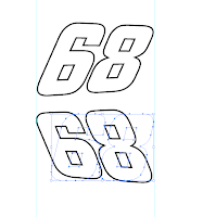
 I like italic racing numbers on bikes. They look like they are forced into leaning backwards as the bike accelerates. At least if you view the bike from the left side. The problem is that if you put italic numbers on the right side of the bike – then they lean the wrong way! Not nice. Thankfully there is a workaround. You will need Adobe Illustrator (or another vector graphics application) and a little patience. But it will be worth it.
 Step 1 is choosing a font that you like. I very much like a font called "City" that was designed in the 1930s for the Berthold type foundry in Berlin. So I chose that.
Step 2 is firing up Adobe Illustrator. Make a new document and write your desired numbers two times. “Create outlines” of the numbers (It's under "Type" in the top menu). This will turn your numbers into easily manipulated vector objects.
Step 3: select the effect called “Free distort” (Effects/Distort & transform/Free distort). You can now distort the numbers into pretty much any shape you like. In order for mine to fit in with the lines of my tail piece I made my numbers a little bit lower towards the end of the bike, which will emphasize the "leaning" effect. I added a black outline to my numbers for that "Nascar" look.
Step 4 is saving your document as an Illustrator eps-document and then emailing it to your local digital printer who will print them on vinyl and cut them out for you. There really isn't more to it!

you thought of everything! yes, that's annoyed me, too about slanty numbers. I think that's why i only bothered putting them on the left side, or else cutting my own decals by hand...
ReplyDeletelet me know if you need help
ReplyDeleteexamples
I had to do the same on my helmet and racebike, it's not so noticeable on the bike as the side numberboards are tiny but I put 2 small numbers on the side of my helmet and from the rear they just looked wrong. A 5 minute fix in illustrator :)
ReplyDeleteYeah, you gotta love those guys at Adobe. Photoshop, Indesign and Illustrator...what would I do without them...
ReplyDeleteI just wish Adobe would do a word processor too.
/D